Tuesday, 24 March 2015
Saturday, 28 February 2015

Friday, 27 February 2015

Saturday, 21 February 2015
Monday, 16 February 2015
Evaluation Question 3
Social Media Comments and Feedback

As a group we decided to make Hidden Empire accounts on various social media platforms, being Twitter, Instagram and Facebook. These social media accounts will not only allow us to gain feedback about the bands work but also will allow us to post updates and behind the scenes footage and images. The most successful platform was Twitter in my opinion as we could monitor feedback and requests whilst being able to post notifications, videos and images. Twitter also became a slight mini portfolio as we developed our work and ensured to keep posts in an orderly fashion. Views from our target audience also impacted on our final products as there opinion is important to recognize being the people we wish to direct the brand Hidden Empire towards.
Questionnaire and Data Collection


Creating a survey on the online platform SurveyMonkey rather than a paper based one at school helped us due to the online platform having a wider audience range, also linking the survey to our twitter account allowed our followers to have an impact on our research. Our school would also have a limited audience in terms of age whilst the online platforms in which we used had a diverse range of views.
We attempted to keep our questions simple however also include variety, the comment boxes in particular allow a choice of opinion which all in all helped our project develop with many detailed opinions being voiced.
Development From Rough Cut


As a group we decided to make Hidden Empire accounts on various social media platforms, being Twitter, Instagram and Facebook. These social media accounts will not only allow us to gain feedback about the bands work but also will allow us to post updates and behind the scenes footage and images. The most successful platform was Twitter in my opinion as we could monitor feedback and requests whilst being able to post notifications, videos and images. Twitter also became a slight mini portfolio as we developed our work and ensured to keep posts in an orderly fashion. Views from our target audience also impacted on our final products as there opinion is important to recognize being the people we wish to direct the brand Hidden Empire towards.
Questionnaire and Data Collection
Creating a survey on the online platform SurveyMonkey rather than a paper based one at school helped us due to the online platform having a wider audience range, also linking the survey to our twitter account allowed our followers to have an impact on our research. Our school would also have a limited audience in terms of age whilst the online platforms in which we used had a diverse range of views.
We attempted to keep our questions simple however also include variety, the comment boxes in particular allow a choice of opinion which all in all helped our project develop with many detailed opinions being voiced.
Development From Rough Cut
Thursday, 12 February 2015
Evaluation Question 2
How effective is the combination of your main product and your ancillary texts?
Colour & Image
.jpg) Throughout our ancillary tasks we decided to keep the original black and white colour format in order to create a consistent correlation between the magazine advert, digipak and music video. This allows the target audience to easily identify the product and in turn generate band recognition. In the creation of the ancillary tasks, we included highlighted shades of gold, which featured on the band logo. We decided that the band logo should remain a constant as it is the main form of identification for the audience. As 'Sail,' would be our bands first music video, we decided to include relevant images of scenery and the artist which were originally featured in the main product. Richard Dyer's, 'Star Theory,' further underlines the significance of the main performer being featured heavily throughout each product. Dyer claims that 'The star must be ordinary and extraordinary. This will attract consumers to the star due to originality'. In reference to this theory, we decided that both the main product and the ancillary tasks will feature the main performer as ultimately the objective of a up and coming music act is to achieve a recognizable image in order to boost sales.
Throughout our ancillary tasks we decided to keep the original black and white colour format in order to create a consistent correlation between the magazine advert, digipak and music video. This allows the target audience to easily identify the product and in turn generate band recognition. In the creation of the ancillary tasks, we included highlighted shades of gold, which featured on the band logo. We decided that the band logo should remain a constant as it is the main form of identification for the audience. As 'Sail,' would be our bands first music video, we decided to include relevant images of scenery and the artist which were originally featured in the main product. Richard Dyer's, 'Star Theory,' further underlines the significance of the main performer being featured heavily throughout each product. Dyer claims that 'The star must be ordinary and extraordinary. This will attract consumers to the star due to originality'. In reference to this theory, we decided that both the main product and the ancillary tasks will feature the main performer as ultimately the objective of a up and coming music act is to achieve a recognizable image in order to boost sales.
Alex Turner was the main inspiration for our performers style. The rather sophisticated style of clothing is strongly representative of the Indie- Rock genre as often the target audience is identified as sub-urban and middle class. Indie artists often dress in alternative of period outfits, which inspired our performers 90's style choice of clothing consisting of a denim jacket and denim trousers. Our artist is seen wearing similar clothing in both our digipak and magazine advert which further links the three pieces together. In the Indie world much of the focus is placed on clothing and performance style as many artists work to develop their way of connecting to the audience. Alex Turner's performance style is very reserved and 'coo'. By incorporating the same style; the lyrics and visuals of both our ancillary tasks and music video become the main form of art and expression. In today's urban youth culture, there are many push factors, such as peer pressure, which lead 21st century youth to distinguish themselves from clothing such as suits. As a band we identified that in order to attract an even bigger target audience, we must alter certain aspects of the indie genre. By using a much more casual yet less threatening wardrobe we established a connection between both the urban and sub-urban cultures in society.

Location
The location is specific to the overall message of the happenings in the video as the empty forest surroundings are symbolic to the depiction of confusion and being lost. In popular culture and fairy tales often the main character of a story is depicted as being lost in a forest. Although our message is much more metaphorical and symbolic, the connotations largely remain the same. By incorporating the scenery of the forest in both the ancillary and the music video, we aim to establish ourselves as a band who focus on a lot of deeper issues as opposed to just selling records. Furthermore, the heavy influence of nature, which was heavily inspired by Paramore's 'decode', creates a heavy contrast as generally nature changes slowly, yet the journey presented is rather fast-paced. A further use of symbolism lays in the motorway scene. Travelling for a very long time through miles upon miles of German motorway, installed a feeling of a never ending journey. In a moment of clarity I decided to include the footage into our music video, and although not much planning went into the particular aspect of location, ultimately I was drawn to the heavy symbolism. We did not include such imagery in our ancillary tasks as it would create unneeded confusion.
Font
The font is pretty simple and minimal across the texts, as both the digipak and magazine advert use the same font. We designed the font from scratch as to create an authenticity in our products. The 'city' like shape aspect of our font on both ancillary tasks imply that we are from urban beginnings hence why much of our font was inspired by the Hip-Hop genre. The music video uses a different font to that of the texts. Why? The answer is pretty simple. In our video upon the spelling of 'A.D.D' we decided to use a basic bold font which would allow the audience to focus more on the on-goings in the scene. The initial reason for including text, (which was heavily debated), was to almost split up the video into manageable scenes.
Conclusion & Improvement
I believe that the combination of my main product and it's relative ancillary texts work well in ensuring that our target audience will want to explore our product further. The colour scheme, font, and location will intrigue the audience. If I had to start such a project again, I would like to explore a different genre of music, possibly Hip-Hop or R&B, this would allow me to work with a wider variety of colours, fonts as well as costume and wardrobe. Nevertheless, in regards to the Indie-Rock genre, I feel as though our group has successfully understood and accommodated to the necessary needs of such an audience.
Tuesday, 10 February 2015
Monday, 9 February 2015


Friday, 6 February 2015


Tuesday, 3 February 2015
Font Experiments

Monday, 2 February 2015
Arctic Monkeys AM Digipak analysis

The packaging includes two compartments each holding either the CD disk or a lyrics booklet, other than that the digipak is extremely simplified and only contains two images and the band logo when fully opened. However I don't believe fans would find this disappointing due to Arctic Monkeys persona being simple and never becoming vibrant or mainstream.
Kasabian 48:13 Digipak Analysis

This deluxe digipak folds out into four separate pieces, two holding disks whilst the others provide track information, artwork and a container which holds a lyrics and artwork booklet.
Not only does this digipak provide a visually pleasing collection of the artists work but also comes with two new exclusive tracks, increasing interest significantly as fans want the full package of what the band has to offer.
Tuesday, 27 January 2015
Modern artwork in use
.JPG)
As the CD is known to have been overtaken in popularity by the use of a simple music download, we took it upon ourselves to brand our digital copy on the platform iTunes.
With the decreasing popularity of the CD, we have decided to evolve into the new age of digital media through a digital album cover. Such covers are usually applicable to ITunes and various services that offer music. As the listening majority transition away from the use of hard copies of music; we as artists must accommodate the demand for new media. This specific piece of advertisement is rather simplistic. The composition features the main artist on the front with the title of the single in the foreground. This allows for easier recognition amongst fans, as through watching the music video, one would be familiar with the face and style of the group.

Monday, 26 January 2015
Sail- Rough Cut
The initial stage of editing our video proved problematic as we contemplated with the idea of pace and beat editing. We decided against the idea of editing strictly to one beat, thus chose to use the various footage that we had to break up patterns. We felt that the song was very unique in the sense that it offered us a lot of freedom with editing. After realising this we decided to split the song into sections which we would edit. This made the process a lot easier to construct, however we faced a dilemma in connecting the individual sections, so that they would make provide the desired effect. After much contemplation we understood that this cut needed much improvement and fine tuning, hence why it only made it to the rough cut stage. We pin pointed some of the key issues present in the video, such as on beat mistakes which needed altering as well as shortening some clips. The incredibly short shot of the dog also is to be removed as it interrupts the continuity of the music and the journey which we are trying to portray. Furthermore whilst exporting the video we assumed that this quality would be sufficient for YouTube, however once uploaded we concluded that we should focus on the technicalities more. The initial rough cut stage was a vital learning curve for us as a group of producers. Ultimately, with much improvement we feel as though we can achieve the desired effect; releasing a product that is worthy of out target audience as well as upholding a professional standard.
Social media
As a group we decided to make Hidden Empire accounts on various social media platforms, being Twitter, Instagram and Facebook. These social media accounts will not only allow us to gain feedback about the bands work but also will allow us to post updates and behind the scenes footage and images. The most successful platform was Twitter in my opinion as we could monitor feedback and requests whilst being able to post notifications, videos and images. Twitter also became a slight mini portfolio as we developed our work and ensured to keep posts in an orderly fashion. Views from our target audience also impacted on our final products as there opinion is important to recognise being the people we wish to direct the brand Hidden Empire towards.

Saturday, 24 January 2015
Tuesday, 20 January 2015

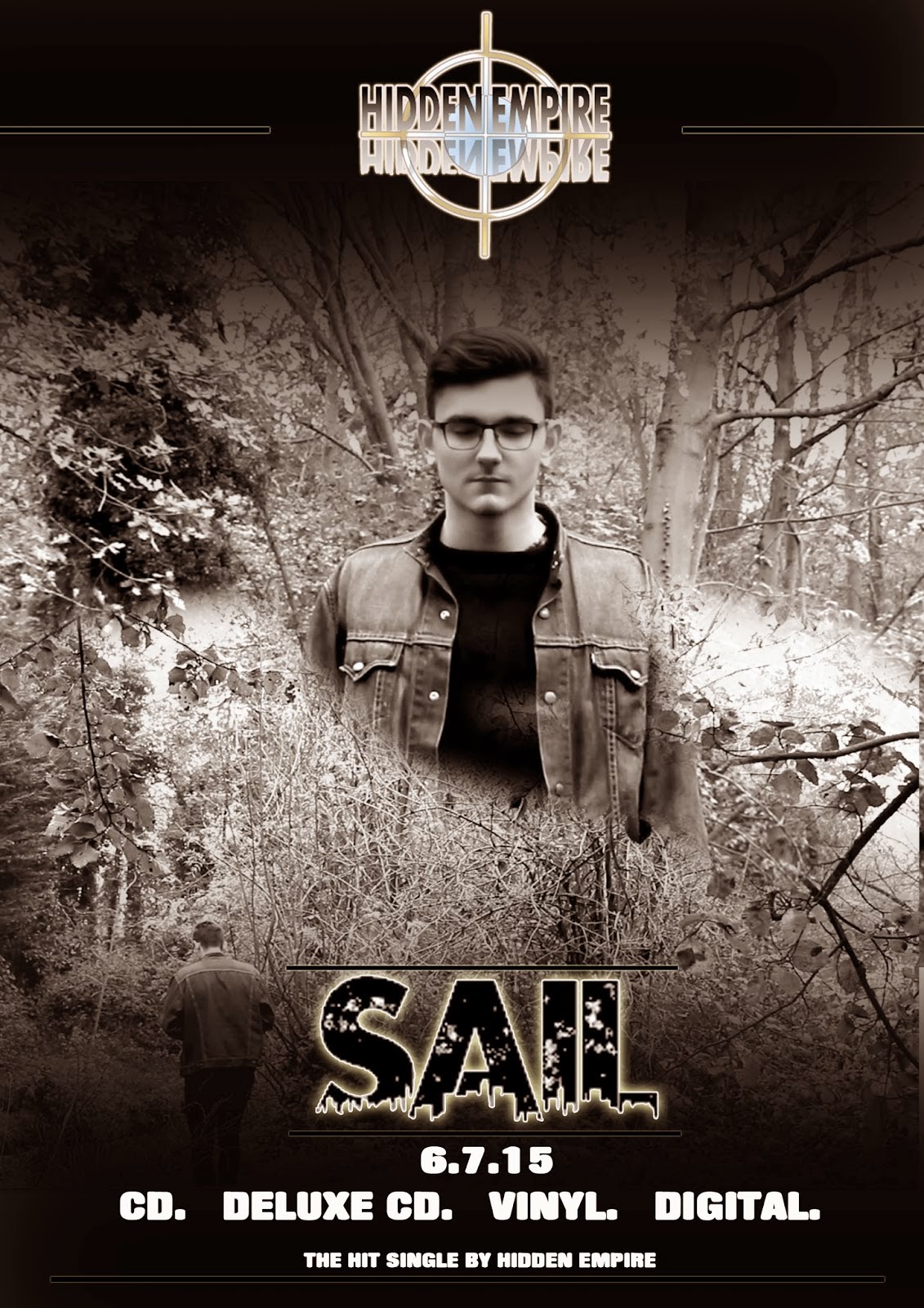
Hidden Empire Poster
.JPG)
We designed a promotional poster with me on the cover. As 'Hidden Empire' is a relatively new band, we wanted to ensure that our first music video and the promotional material focuses heavily on the image. We took inspiration from various 'up and coming' artists as new artists must ultimately create a band image/brand.
Promotional flyer
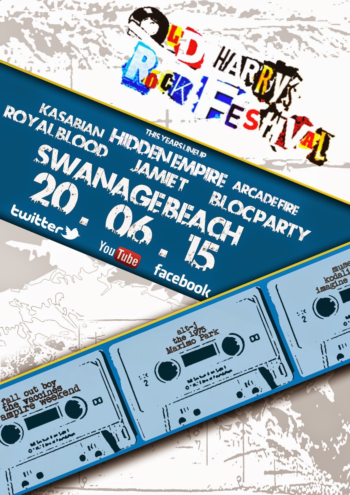
Hidden Empire are headlining the new 'Old Harry's Rock Festival' performing alongside other alternative rock greats, don't miss it and get your tickets now.
Thursday, 8 January 2015
Design

Wednesday, 7 January 2015

Subscribe to:
Posts (Atom)