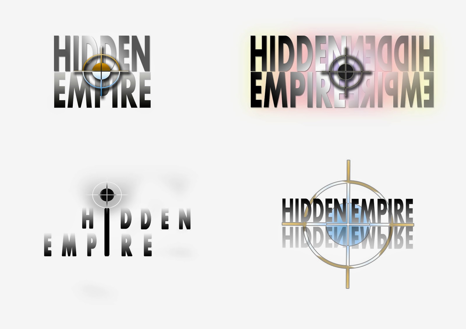
I started to design some logos in Adobe Photoshop, from my research I noticed the band name was commonly displayed and used as the stimulus of the logo, so I decided in all my logos to use the name 'Hidden Empire' which I created and use it as the main attraction in each logo.
I did this by firstly making the each font bold and simple to read in order for the text to inform and strike the audience. I decided to use the cross-hair shape due to it being a simple yet visually pleasing whilst also acting as a location sign relating to the 'Hidden' aspect of the band name.
Wednesday 2 July 2014
Tuesday 1 July 2014
Logo research
During my time researching band logos I found most logos to mainly consist of text displaying the bands name in a particular style. Most text based logos distort or change certain letters such as the 'Kiss' logo which changes the 's' to look like lightning bolts, this also gives the brand name personality.
Some logos, such as the Rolling Stones logo uses an iconic image without text, these logos are particularly memorable and usually also symbolises the band. The tongue is animated and uses solid colours, this is due to the logo having to be simple yet effective, the highlights also leave a glossy feel and the tongue being stuck out gives a rock-and-roll impression to the band.
Subscribe to:
Posts (Atom)
